
Money
Shane Oliver's 5 charts on investing to keep in mind in uncertain times

Markets love a wobble and 2025 has delivered more than its fair share. Shane Oliver cuts through the noise with five charts that show what really matters when everything feels uncertain.
By Dr Shane Oliver
Every so often the degree of uncertainty around investment markets surges and we have seen several bouts of that this year with President Trump’s tariffs, conflict in the Middle East including the US intervention in the brief Iran/Israel war, the ongoing Russia/Ukraine war and periodic flare ups in US/China tensions.
We have been going through a similar bout of uncertainty in the last few weeks with worries about US share market valuations, fears of an AI bubble and uncertainty about how much and when the Fed and RBA will be able to cut interest rates driving falls in share markets.
Given this latest bout of uncertainty now is a critical time to stick to the basic principles of sound long term investing. So, this note revisits five charts I find useful in times of uncertainty like the present.
Chart #1: The power of compound interest
This is my favourite chart. It shows the value of $1 invested in various Australian assets in 1900 allowing for the reinvestment of dividends and interest along the way. That $1 would have grown to $271 if invested in cash, to $987 if invested in bonds and to $989,055 if invested in shares up until the end of May 2020. That variance will only have grown far larger over the past 5 years.
While the average return since 1900 is only double that in shares relative to bonds, the huge difference between the two owes to the impact of compounding – or earning returns on top of returns over time. So, any return earned in one period is added to the original investment so that it all earns a return in the next period. And so on. Out of interest, residential property is similar to shares over the long term.
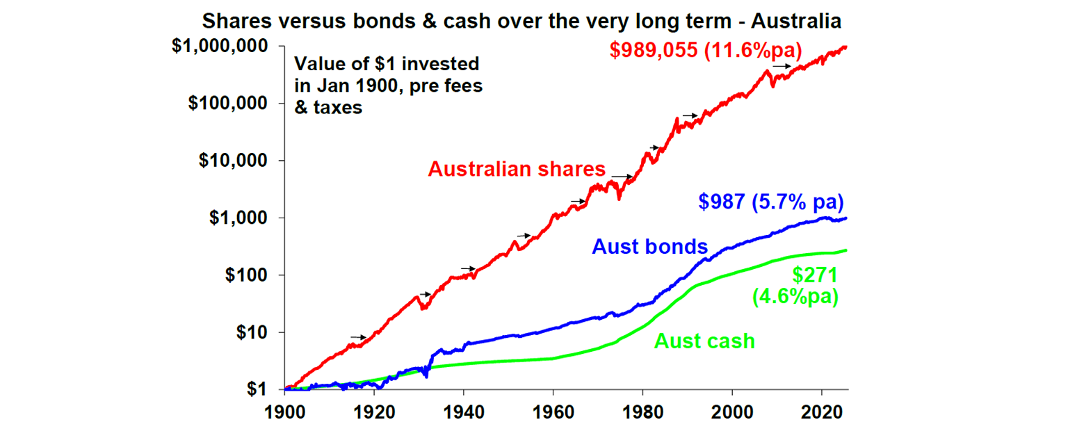
Key message: To grow our wealth, we must have exposure to growth assets like shares and property.
Chart #2: Don’t get blown off by cyclical swings
The trouble is that shares can have lots of setbacks along the way, for example as highlighted by the arrows on the previous chart. Even annual returns in the share market are highly volatile, but longer-term returns tend to be solid and relatively smooth, as can be seen in the next chart. Since 1900, for Australian shares roughly two years out of ten have had negative returns but there are no negative returns over rolling 20-year periods.

Understanding that these periodic setbacks are just an inevitable part of investing is important in being able to stay the course and get the benefit of the higher long-term returns shares and other growth assets provide.
More on this: Markets are choppy. What should you do with your super if you are near retirement?
Key message: Short-term violent swings in share markets are a fact of life but the longer the time horizon, the greater the chance your investments will meet their goals. So, in investing, time is on your side and it’s best to invest for the long-term when you can.

Chart #3: The rollercoaster of investor emotion
It’s well-known that investment markets move more than can be justified by moves in investment fundamentals, because investor emotion plays a huge part. The next chart shows the roller coaster that investor emotion traces through the course of an investment cycle.
Once a cyclical bull market turns into a bear market, euphoria gives way to anxiety, denial, capitulation and ultimately depression at which point the asset class is under-loved and undervalued and everyone who is going to sell has – and it becomes vulnerable to good (or less bad) news. This is the point of maximum opportunity for investors to buy into an asset at depressed prices. Once the cycle turns up again, depression gives way to hope, optimism and eventually euphoria. This is the point of maximum risk.
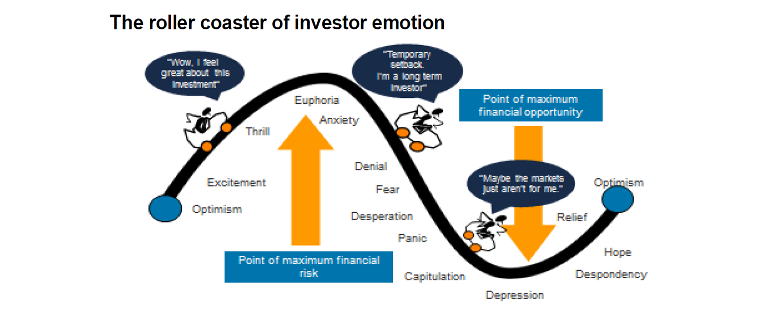
Key message: Investor emotion plays a huge role in driving swings in markets. The key for investors is not to get sucked into this emotional roller coaster. Of course, this is easier said than done, so many investors end up getting wrong footed – by buying at the top when everyone is bullish and selling at the bottom when everyone is bearish (like back in April on tariffs, or maybe soon on worries about the Middle East).
Chart #4: The wall of worry
There is always something for investors to worry about. And in a world where social media is competing intensely with old media it’s more magnified and so seems more worrying. This is arguably evident again now in relation to uncertainty about tariffs and the war in the Middle East, with Trump’s contradictory and confusing utterances providing perfect click bait but serving to add to fears.
The global economy has had plenty of worries over the last century, but it got over them with Australian shares returning 11.6% per annum since 1900, with a broad rising trend in the All Ords price index as evident in the next chart, and US shares returning 10% pa. (Note that this chart shows the All Ords share price index whereas the first chart shows the value of $1 invested in the All Ords accumulation index, which allows for capital growth & dividends.)
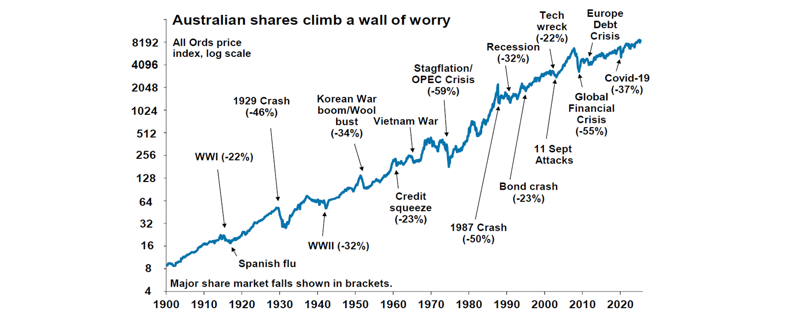
Key message: Worries are normal around the economy and investments and sometimes they become intense – like now. But they eventually pass.
Read this too: Hard work usually pays off - but not when it comes to money
Chart #5: Timing is hard
With the benefit of hindsight many swings in markets around things like the GFC and the 2022 inflation surge look inevitable and so it’s natural to think why not switch between, say, cash and shares within your super fund to anticipate market moves. This is particularly the case in times of emotional stress when the news is bad.
But trying to time the market is difficult. A good way to demonstrate this is with a comparison of returns if an investor is fully invested in shares versus missing out on the best (or worst) days. The next chart shows that if you were fully invested in Australian shares from January 1995, you would have returned 9.6% pa (with dividends but not allowing for franking credits, tax and fees).
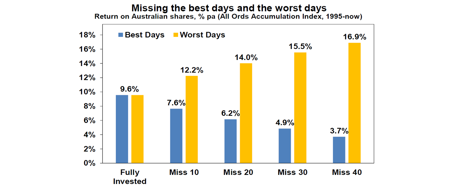
If by trying to time the market you avoided the 10 worst days (yellow bars), you would have boosted your return to 12.2% pa. And if you avoided the 40 worst days, it would have been 16.9% pa! But many investors only get out after bad days and miss some of the best days. If by trying to time the market you miss the 10 best days (blue bars), the return falls to 7.6% pa. If you miss the 40 best days, it drops to just 3.7% pa.
Key message: Trying to time the share market is not easy. For most it's best to stick to an appropriate, well thought-out long-term investment strategy.
This article contains general information only. It is not financial advice and is not intended to influence readers’ decisions about any financial products or investments. Readers’ personal circumstances have not been taken into account and they should always seek their own professional financial and taxation advice that takes into account their financial circumstances, objectives and needs.
Feature image: iStock/ridvan_celik
Tell us in the comments below: How often do you check your super?

More from Shane: